In 2024, the Timiskaming Ontario Health Team (TOHT) partners embarked on a journey to create a brand identity and website for their newly formed Ontario Health Team (OHT), one of the last to be formed in Ontario.
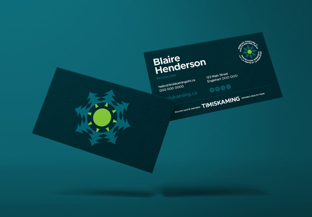
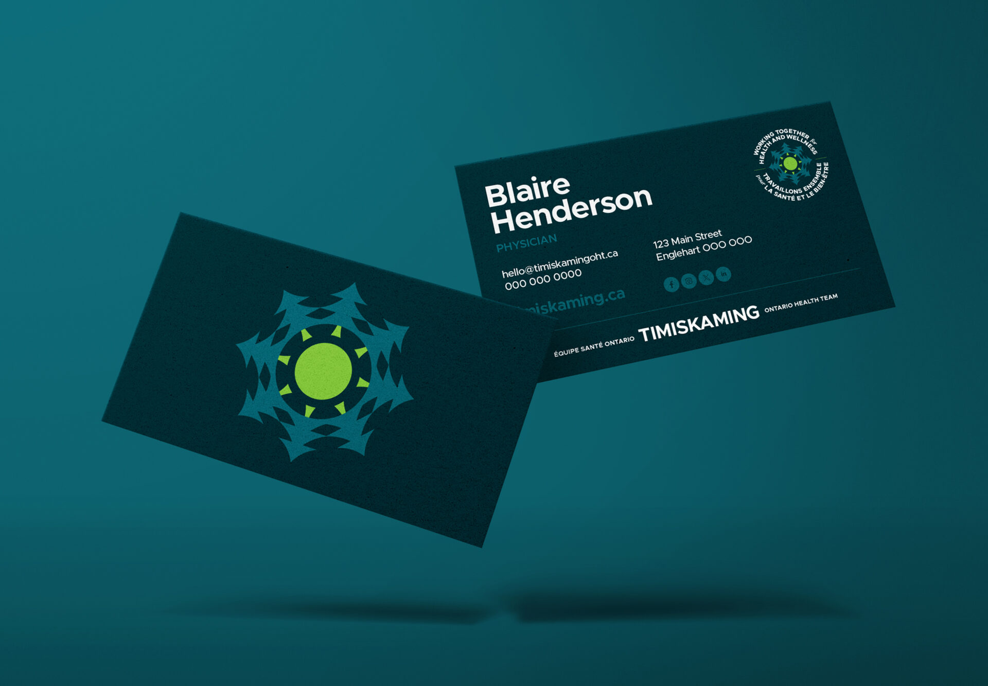
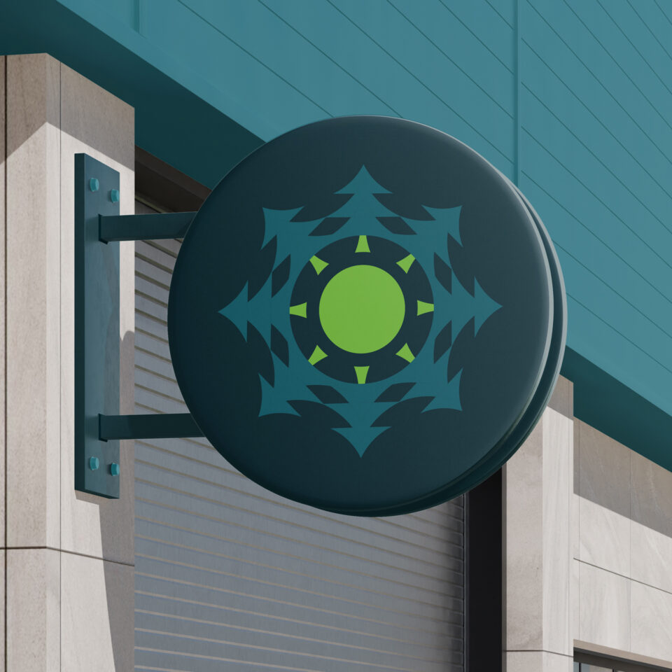
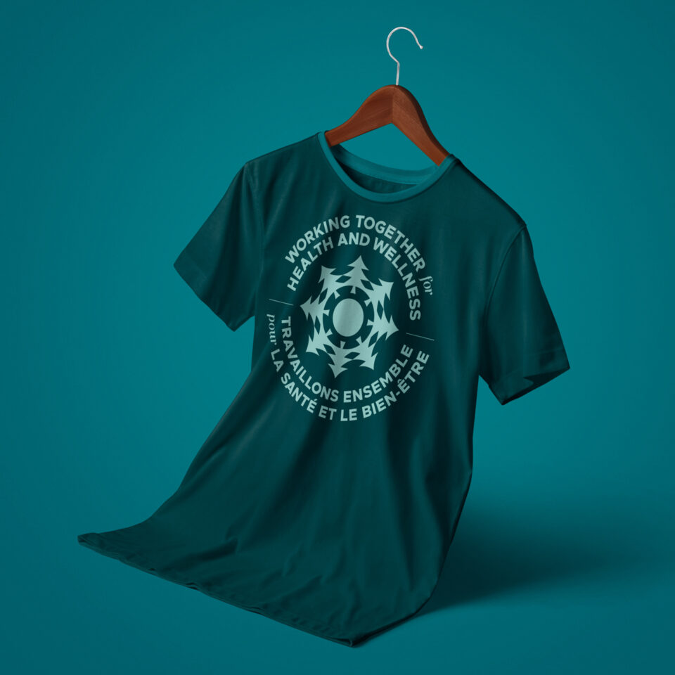
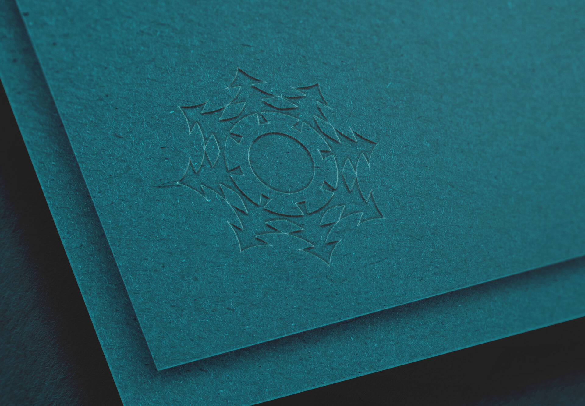
The icon consists of three key elements: Pine Trees, Circles, and the Sun, all presented in a green palette to represent the Northern Ontario landscape, growth, vibrant health, and elements connected to life.
The Jack Pine was chosen to represent the spirit of the Northern Ontario Landscape. It also represents wisdom, longevity, endurance, fortitude, renewal and a bright, hopeful future. Aligning the trees in a circle represents connectivity, inclusion and collaboration between partners (working together). It also appears to be protecting what’s in the centre. The sun is in the centre, representing life, growth, peace, warmth and radiant healing, reinforcing our mission to foster a healthier future for all.
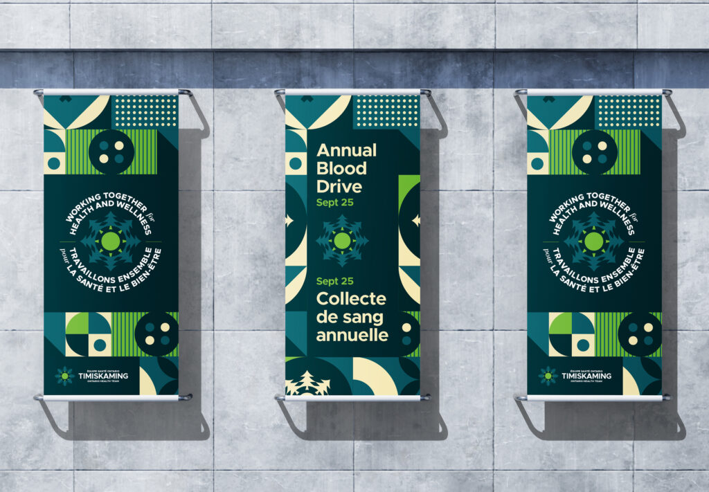
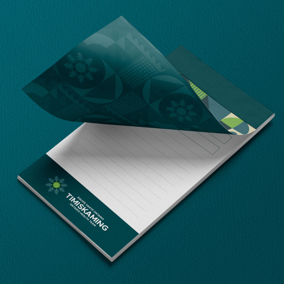
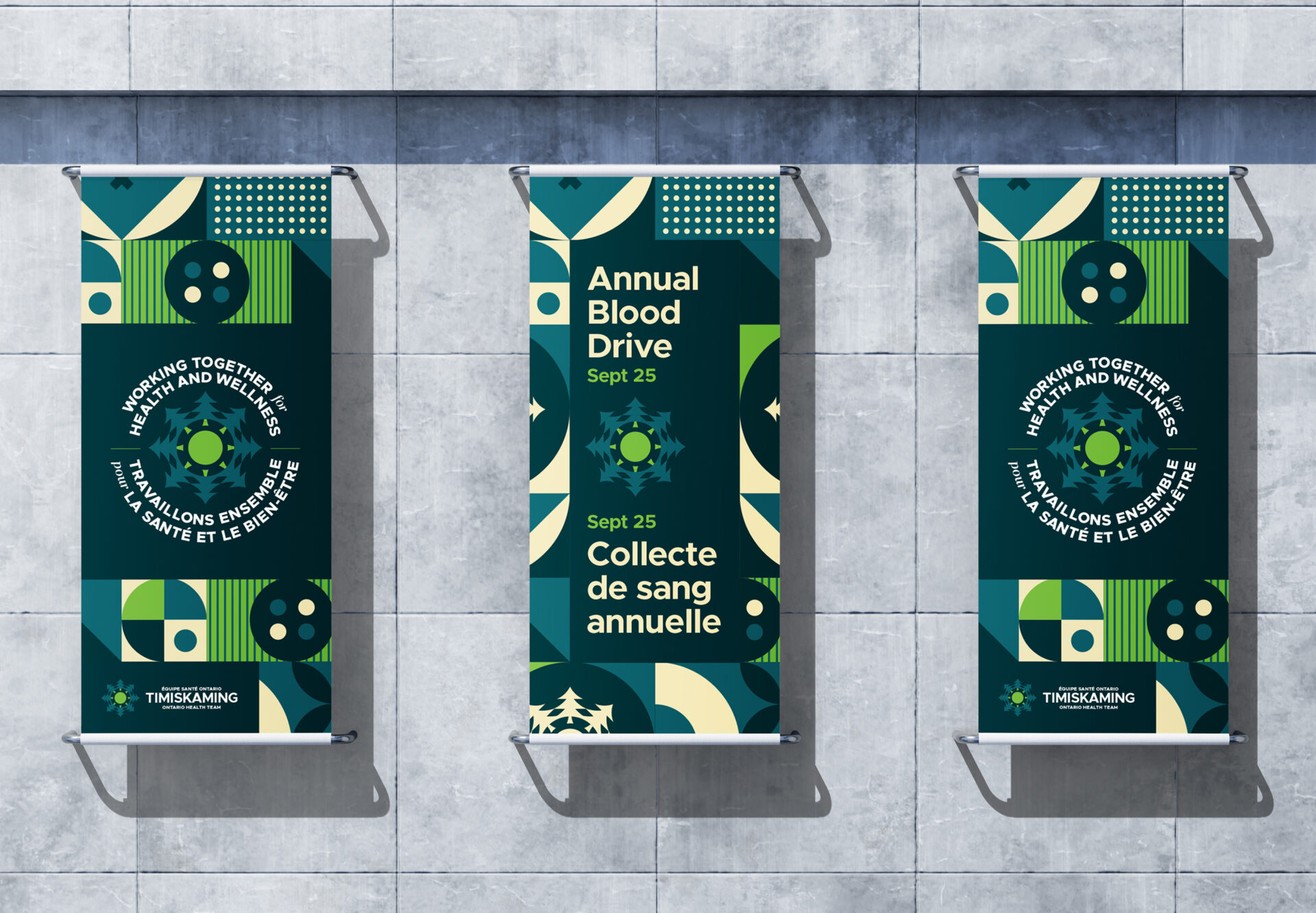
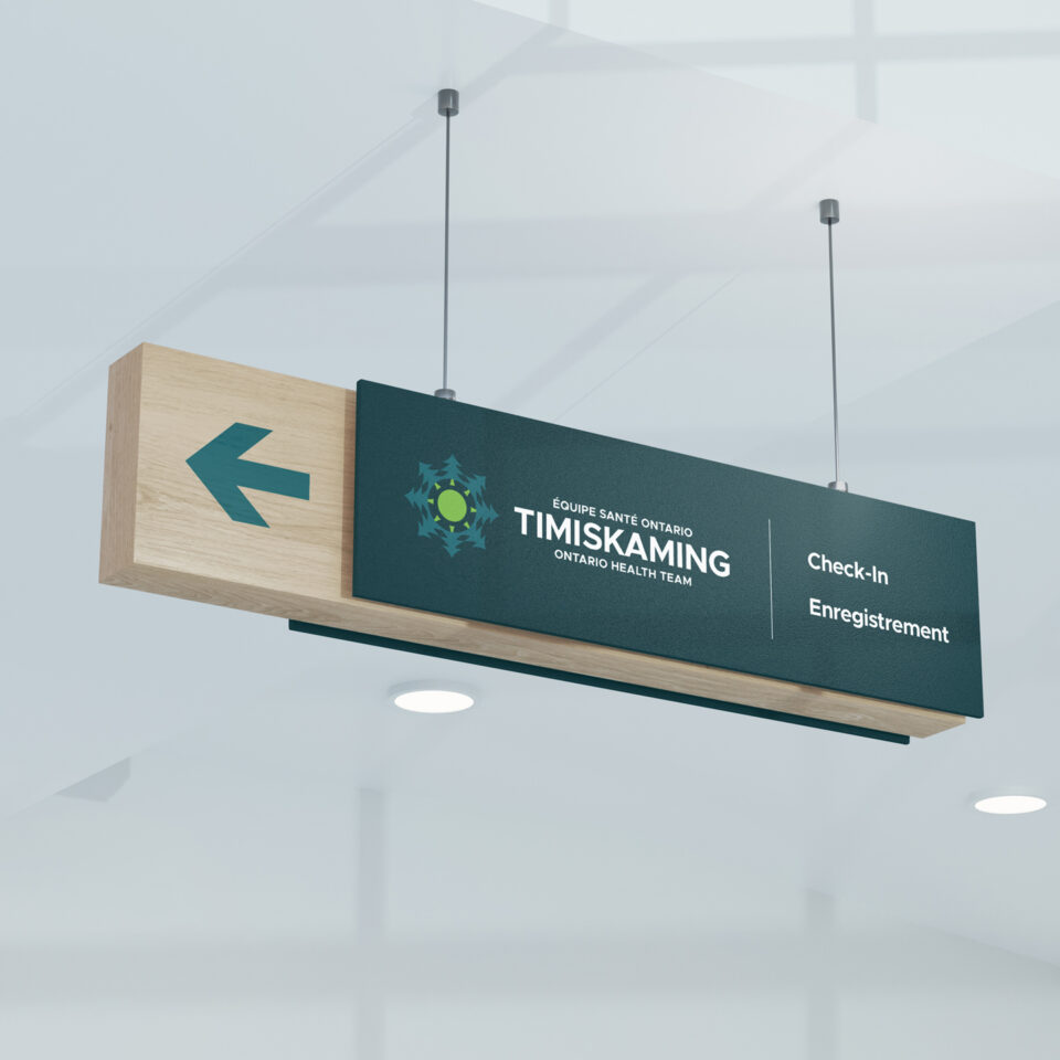
After the brand was solidified, brand standards and additional collateral were created. Next, a dynamic website was developed for the organization with a full CMS to provide the organization with autonomy to control the website moving forward.